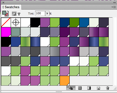
Every designer wants to render their document exactly as intended. Color management is critical in this process. When it comes to color, the less colors in your palette, the better. It introduces consistent swatches and tones and makes it easier to manage for print. Recently, I was putting the final touches on a piece and noticed the amount of swatches I was experimenting with:
Clearly, I need a little bit of spring cleaning in the box. But, it’s close to approval to print (ATP) and I can’t go hunting willy-nilly picking off colors. That would be a tedious process. I decided to try something else.
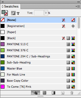
First, I organized my most important document swatches. I make sure I label them and clearly define them for production. I also ensure the color values are as similar as possible (did you know, you can also merge swatches by highlighting them, right-clicking, and hitting Merge Swatches?):
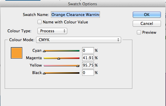
Next, I create a color that completely contrasts with the entire design (i.e. orange). I call this a Clearance Color.
Finally, I delete all my crazy swatch combinations and replace them with the Clearance Color. The beauty of this tip relies on InDesign’s ability to reassign swatches after deletion.
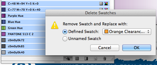
This will go ahead and “highlight“ all of your problem colors. Now, go ahead and replace those colors with your consistent palette.
Enjoy your tidy color palette.